a scrolling, optionally labelled, icon list
Properties:
| class | class | This property must be set to icon list box. |
| bounds | rectangle | |
| font* | integer | The index of the font spec to use for the list's contents' labels. (4) [W] |
| enabled* | boolean, integer or list | [W] |
| value* | integer or list | The selected item or items. (0 Æ no selection) [R/W] |
| flags* | integer | Selection flags for this list (see class list box above). (130) |
| contents | list of integers | The list of icon family IDs constituting the list's items. The labels come from the resource names of the 'ICN#' resources. [W] |
| action* | integer | The value returned when a list item is double clicked. (0 Æ no double click) |
| Return value: |
| if only single selections are allowed: |
| | integer | Index of the currently selected item or 0 if no selection. |
| if multiple selections are allowed: |
| | list of integers | List of indices of the currently selected items or 0 if no selection. |
Example:
set iconIDs to [200, 201, 202, 203, 204, 205, 206, 207, 208, 209, 210, 211, 212]
set rf to res open alias "A Disc:A Folder:An Icon Resource File" with keep in chain
	-- The icon resources IDs 200-212 come from the above file
dd auto dialog {size:[200, 312], contents:{class:icon list box, contents:iconIDs, action:1, bounds:[10, 10, 190, 302]}}
res close rf
|
The icon list box class provides a vertical, single column, scrolling list of centred and labelled icons. It is similar to that used in the old Control Panels desk accessory before System 7 and Eudora's Settings dialog. The contents property contains a list of integers that specifies the resource ID of the icon family to use for each list item.
The icons may reside in the resource fork of the script file, applet or current application or in an external file via use of the command res open <alias> with keep in chain from the Resource Utilities scripting addition (as in the above example). The large icons ('icl8', 'icl4' & 'ICN#') are always used (if available). The label is provided by the 'ICN#''s resource name (this may change in future versions) and is drawn, centred under the icon in the specified font.
The height of an icon list box should be a multiple of the row height + 2 (for the frame). The row height = 10 + icon height + text height = 42 + text height. For the standard Chicago, 12pt font text height = 16. Therefore height of list box = (rows displayed) * 48 + 2. Icon list boxes support all the same keyboard
an optionally labelled editable text item
| Properties: |
| class | class | This property must be set to text field. |
| bounds | rectangle | |
| font* | integer | The index of the font spec to use for the button's name. (4) [W] |
| enabled* | boolean, integer or list | [W] |
| name* | string | Label/prompt text of the item. (no name) |
| name bounds* | rectangle | Bounding box of the name text. This must be specified if a name is specified. (no name bounds) |
| value* | string | Initial editable text of the item. ("") [R/W] |
| Return value: |
| | string | The current editable text of the item. |
Example:
set ed1 to {class:text field, bounds:[60, 160, 200, 176], name bounds:[10, 160, 60, 180],
	name:"Text:", value:"default text"}
|
A text field dialog item presents a standard editable text area with an optional label. Text fields will automatically scroll as you move the insertion point around and when you drag with the mouse. They wrap the text around on multiple lines and support up to 32,000 characters of text. Single line text fields behave slightly differently to multi-line text fields. They scroll horizontally first (by as much as their visible width) before wrapping the text and scrolling vertically, and when they have the keyboard focus the return key is mapped to the default push button. In multi-line text fields pressing return inserts it into the text. A single line text field should have a height of 16 for the 12pt Chicago font and 12 & 13 for the 9pt & 10pt Geneva fonts respectively. Multi-line text fields look best if their heights are multiples of the single line text field height. The frame of a text field is draw outside the bounds rectangle by 3 pixels in each direction.
Text fields and password fields fully support the extended keyboards including:
| f2 | cut |
| f3 | copy |
| f4 | paste |
| del | delete forward |
| home | move insertion point to start of text |
| end | move insertion point to end of text |
| page up | move insertion point up by height of field |
| page down | move insertion point down by height of field |
| clear | delete selection |
| tab | move keyboard focus to next focusable item |
| shift-tab | move keyboard focus to previous focusable item |
| command-A | Select all |
Note: Part or all of a text field or password field in an open dialog may be selected by setting its selection property to a list containing two integers that define the beginning and end of the selection. The statement take the form: dd set selection of <item ref> to [<integer>, <integer>]. The integers represent positions after the character they index:
| e.g. [0,0] - put insertion point at start of field |
| e.g. [0,1] - select first character (from before first to after first) |
| e.g. [1,3] - select second & third characters (from before second to after third) |
| e.g. [3,-1] - select fourth character through the end of the text (from before fourth to end) |
an opaque editable text item
| Properties: |
| class | class | This property must be set to password field. |
| bounds | rectangle | |
| font* | integer | The index of the font spec to use for the button's name. (4) [W] |
| enabled* | boolean, integer or list | [W] |
| name* | string | |
| name bounds* | rectangle | |
| value* | string | As for an exit text item, but always displayed as bullets. [R/W] |
| Return value: |
| | string | The current editable text of the item (the actual text, not the bullets). |
Example:
set pwd to {class:password field, bounds:[10, 36, 250, 36 + 16],
	name bounds:[10, 10, 250, 26], name:"Enter Password:"}
|
A password field dialog item behaves identically to a text field dialog item except that it displays its text as a series of bullets (*) instead of the actual characters. See Class text field for more details.
a static text item
| Properties: |
| class | class | This property must be set to static text. |
| bounds | rectangle | |
| font* | integer | The index of the font specification to use for the contents. (3) [W] |
| enabled* | boolean, integer or list | If disabled the text appears greyish. [W] |
| contents | string | The displayed text of the item. [W] |
| justification* | text alignment | How to align/justify the text. One of:
| flush default | Aligned according to the primary line direction (default) |
| left | Left aligned for all scripts |
| center | Centred for all scripts |
| right | Right aligned for all scripts |
|
| Return value: |
| | null | This class of item returns nothing. |
Example:
dd install with fonts [null, null, null, null, {style:[bold, condensed]}, {size:18, name:"Times", style:3}]
	-- Display "Some Text" using 18pt Times in bold, italic style
{class:static text, contents:"Some Text", bounds:[10, 10, 220, 30], font:6}
	-- Display aString using the system font and size in bold, condensed style
set aString to "A sample string!"
set st1 to {class:static text, contents:aString, bounds:[410, 10, 520, 42], font:5}
|
A static text dialog item is a passive item that can display up to 32,000 characters of text (if you have a big enough screen). Although entitled static text the contents, font and the enabled state may be changed dynamically (see example scripts).
A disabled static text item displays its text in a paler hue of its font's specified colour. The text is displayed wrapped, and clipped at the bottom, within the bounds specified. Static text items look best if their heights are multiples of their font's height. This is 16 for the 12pt Chicago font and 12 & 13 for the 9pt & 10pt Geneva fonts respectively.
an optionally labelled rectangular frame or separator line item
| Properties: |
| class | class | This property must be set to group box. |
| bounds | rectangle | |
| font* | integer | The index of the font specification to use for the contents. (3) |
| enabled* | boolean, integer or list | [W] |
| name* | string | Label/title text of the frame. (no name) |
| style* | frame style | The style in which the group box is to be drawn. (primary group)
| frame style | AGA | Normal |
| primary group | etched line | black frame |
| secondary group | indented box | grey frame |
| tertiary group | raised box | light grey frame |
|
| Return value: |
| | null | This class of item returns nothing. |
Example:
set box1 to {class:group box, name:"Box", bounds:[300, 16, 490, 112], style:secondary group}
|
If the width of the bounds rectangle <= 4 then the item is drawn as a vertical separator. If the height of the bounds rectangle <= 4 then the item is drawn as a horizontal separator. In any case the specified style is used to draw the rectangular frame, vertical separator or horizontal separator.
In DD v0.7 labelled group boxes are draw differently to previous releases. The bounds property specifies the maximum extent of any drawing i.e. if any name label is specified then it is drawn with its ascent within the bounds and the top line of the frame is offset below the top of the bounds rectangle by the ascent of the label's font. This offset is 12 for the 12pt Chicago font and 10 for both the 9pt and 10pt Geneva fonts. Also a small gap is inserted in the frame both left and right of the label.
a picture item
| Properties: |
| class | class | This property must be set to pict. |
| bounds | rectangle | The picture is scaled to fit this rectangle. |
| contents | picture or integer | A Quickdraw picture or ID number of a picture ('PICT') resource [W]. |
| Return value: |
| | null | This class of item returns nothing. |
Example:
set pic1 to {class:pict, bounds:[10, 90, 10 + 198, 90 + 47], contents:131}
|
The res id and data properties have been replaced with the contents property. A pict dialog item draws a Quickdraw picture into the bounds rectangle using either an picture resource (given an ID number) or the full picture data. Currently the picture is always scaled to fill the bounds rectangle. A pict is a passive dialog item i.e. it does not respond to mouse clicks.
an icon item
| Properties: |
| class | class | This property must be set to icon. |
| bounds | rectangle | The icon is scaled to fit this rectangle. |
| contents | icon or integer | A colour or black & white icon or ID number of the icon ('cicn' or 'ICON') resource [W]. |
| Return value: |
| | null | This class of item returns nothing. |
Example:
set icn1 to {class:icon, bounds:[160, 10, 192, 42], contents:128}
|
The res id and data properties have been replaced with the contents property. An icon dialog item draws a colour or black & white icon graphic into the bounds rectangle using either an icon resource (given an ID number) or the full icon data. The icon is always scaled to fill the bounds rectangle. An icon is a passive dialog item i.e. it does not respond to mouse clicks.
a dummy dialog item
| Properties: |
| class | class | This property must be set to dummy. |
| enabled* | boolean, integer or list | [W] |
| Return value: |
| | boolean | The current state of the item, as determined by its enabled property. |
Example:
	-- If items 1, 2 & 3 are text or password fields then this item's state would be on
	-- only when all 3 fields contained some text
set dum1 to {class:dummy, enabled:[dAnd, 1, 2, 3]}
|
The only purpose of dummy dialog items is to enable the combination of dependencies into even more complex structures (or possibly to return the combined state of several items). Any dialog item that depends on a dummy item (via the dummy's index appearing as a value of the item's enabled property) must appear after that dummy item in the dialog's contents list. See the Dependencies section below for more details and the example script "SuperCT2.as".
a colour picking item
Properties:
| class | class | This property must be set to color picker. |
| bounds | rectangle | |
| enabled* | boolean, integer or list | [W] |
| value | RGB colour | The colour of the picker's swatch. [R/W] |
| flags* | integer | The color picker flags. (0) [Ignored] |
| Return value: |
| | RGB colour | The current colour of the item's swatch. |
Example:
dd auto dialog {size:[260, 100], contents:[
	{class:push button, bounds:[190, 70, 250, 90], name:"OK"},
	{class:color picker, bounds:[10, 10, 90, 90], value:[11100, 22200, 33300]}
		]}
|
A color picker is an interactive dialog item that displays a framed, rectangular swatch of colour that when clicked allows the user to choose a colour using the standard color picker dialog.
The value property is in [red, green, blue] format, where 0 is no colour and 65535 is maximum colour.
a graphical magnitude indicator
Properties:
| class | class | This property must be set to gauge. |
| bounds | rectangle | |
| enabled* | boolean, integer or list | [W] |
| value* | integer | The size of the gauge indicator bar. (0) [R/W] |
| max value* | integer | The maximum value of the gauge. (100) [W] |
| Return value: |
| | integer | The current value of the gauge. |
Example:
property theMax : 1234
dd install with grayscale
set p to dd make dialog {size:[300, 50], contents:[
	{class:static text, contents:"Thinking...", bounds:[8, 4, 160, 20]},
	{class:gauge, bounds:[10, 25, 290, 25 + 12], value:0, max value:theMax}
		]}
repeat with n from 1 to theMax
	dd set value of item 2 of p to n
end repeat
dd delete p
dd uninstall
|
A gauge is a passive dialog item that displays an integer value as a horizontal indicator bar that fills a relative proportion of the left side of an enclosing frame. Alternatively it may display a barber pole that fills the entire frame.
When max value is a positive integer then setting value to an integer between 0 and max value displays a bar that fills the left value/max value of the part of the gauge. Setting value to <= 0 displays an empty gauge, and setting value to >= max value displays a full gauge. Setting max value to a negative integer causes a barber pole to be drawn. Repeatedly incrementing value causes the barber pole to rotate forward, Repeatedly decrementing value causes the barber pole to rotate backward.
a push button with an icon & a bevelled edge
| Properties: |
| class | class | This property must be set to icon push button. |
| bounds | rectangle | |
| enabled* | boolean, integer or list | [W] |
| style* | integer | The button appearance style. (12) |
| contents | integer | An ID number of a family of icon resources. [R/W] |
| Return value: |
| | boolean | True if this button was used to dismiss the dialog, otherwise false. |
Example:
	-- A 1 pixel deep button with a small icon
{class:icon push button, bounds:[357, 274, 377, 293], contents:1001, style:5}
|
An icon push button is a dialog item that behaves similarly to a push button but displays an icon instead of a text label. The icon displayed can be large, small or mini and may be in black & white, 16 colours or 256 colours. The icon data is stored in an icon resource. The type of the icon resource is:
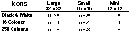
The depth of the icon drawn is based on the depth of the VDUs the icon intersects and the depths of the available icons. The most appropriate icons are automatically chosen from those available. If the requested icon is not available then the next best one will be substituted.
Only the required size(s) of icon need exist for a given icon family. However, even if not used directly the black & white icon resource needs to exist as it also contains the icon mask. ResEdit can be used to create and edit the various icon resources (except for the mini icons).
Setting the contents property to -1 causes the button to be drawn blank (with no icon).
Note: You can copy the icon from any "Get Info" window in the Finder and paste it into a file open in ResEdit. This will generate a family of ICN#, icl4, icl8, ics#, ics4 & ics8 resources.
The style property dictates the visual construction of the button. It controls both the 3D height of the button (in greyscale mode) and the size of the icon drawn. The value of style can be calculated from the following table:
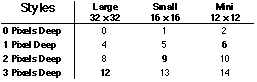 or by using: (one of: large=0, small=1, mini=2) + (4 x depth)
Icon buttons should be large enough to contain the size of the specified icon and 3D border. The standard 3D depths for the different icon sizes are those opposite the bold items in the above table. The default value of the style property is 12 which produces a 3 pixel deep button with a large icon. (See the example "Icon Buttons.as" for a full demo.)
a toggle button with an icon & a bevelled edge
| Properties: |
| class | class | This property must be set to icon toggle button. |
| bounds | rectangle | |
| enabled* | boolean, integer or list | [W] |
| value* | boolean | If true then the button is on. (false) [R/W] |
| style* | integer | The button appearance style. (12) |
| contents | integer | An ID number of an icon family ('ICN#') resource. [R/W] |
| Return value: |
| | boolean | True if this button is in the on state, otherwise false. |
Example:
	-- A 1 pixel deep button with a small icon
{class:icon push button, bounds:[357, 274, 377, 293], contents:1001, style:5}
|
An icon toggle button is visually similar to an icon push button, but behaves like a check box dialog item. Alternate clicks toggle it between on & off states. In its off state it appears like an unpressed icon push button. In its on state it appears with a highlighted body and a non-highlighted icon. See class icon push button above for more details.
a sticky button with an icon & a bevelled edge
| Properties: |
| class | class | This property must be set to icon sticky button. |
| bounds | rectangle | |
| enabled* | boolean, integer or list | [W] |
| value* | boolean | If true then the button is on, and is drawn highlighted. (false) [R/W] |
| style* | integer | The button appearance style. (12) |
| contents | integer | An ID number of an icon family ('ICN#') resource. [R/W] |
| Return value: |
| | boolean | True if this button is in the on state, otherwise false. |
Example:
	-- A 1 pixel deep button with a small icon
{class:icon sticky button, bounds:[357, 274, 377, 293], contents:1001, style:5}
|
An icon sticky button is visually similar to an icon push button, but behaves like a single radio button dialog item. (Clicking it when off switches it on, other clicks are ignored.) In its off state it appears like an unpressed icon push button. In its on state it appears with a highlighted body and a unhighlighted icon. See class icon push button above for more details.
a radio button with an icon & a bevelled edge
| Properties: |
| class | class | This property must be set to icon radio button. |
| bounds | rectangle | |
| enabled* | boolean, integer or list | [W] |
| value* | boolean | If true then the button is on, and is drawn highlighted. (false) [R/W] |
| style* | integer | The button appearance style. (12) |
| contents | integer | An ID number of an icon family ('ICN#') resource. [R/W] |
| Return value: |
| | boolean | True if this button is in the on state, otherwise false. |
Example:
	-- A 1 pixel deep button with a small icon
{class:icon radio button, bounds:[357, 274, 377, 293], contents:1001, style:5}
|
An icon radio button is visually similar to an icon push button, but behaves like a radio button dialog item. (Clicking it when off switches it on, further clicks are ignored.) A contiguous set of adjacent icon radio button dialog items form a group. Clicking one member of a group sets its value to true (and highlights it), and the value of the previously on member of the group to false (and unhighlights it). Icon radio button groups are delimited by any other type of dialog item. In its off state it appears like an unpressed icon push button. In its on state it appears with a highlighted body and a unhighlighted icon. See class icon push button above for more details.